
Oh My Styled Life
2022 in Paint: A Paint Palette for your Whole Home
Selecting one paint color can be overwhelming, and when it comes to selecting a whole paint palette for your home – where do you begin? With so many colors and finishes to choose from, we’re here to help ensure you’ve selected the right shades and tones for your home.
With a new year comes new color trends, and no matter your paint palette of choice, this post is all about integrating color throughout your home for a cohesive and intentional aesthetic.
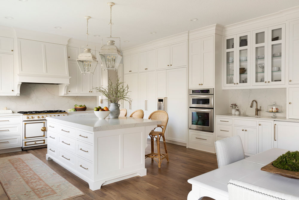
White on White
White is here to stay and it’s an undeniably classic option. It pairs well with most finishes and colors, feels fresh and clean, and offers maximum versatility. This home feels anything but sterile thanks to warm finishes and subtle accent colors.
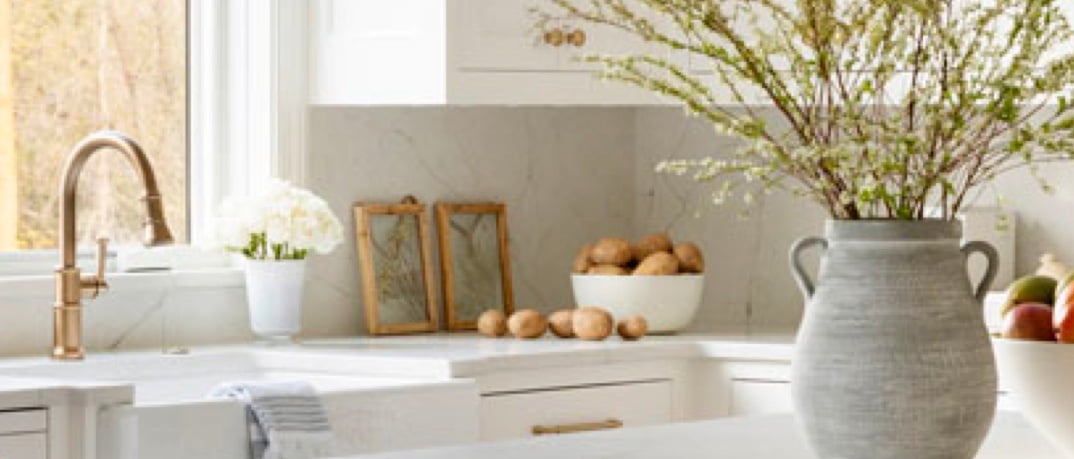
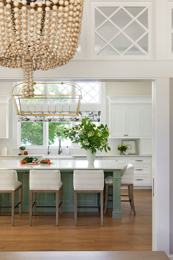
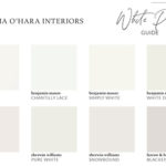
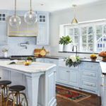
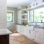
This kitchen is the perfect example of the white-on-white trend. White cabinetry in Sherwin Williams Alabaster complements brighter wood finishes and white appliances with subtle gold accents. The Calacatta Valentin Quartz countertops and backsplash polish off our client’s desired aesthetic.
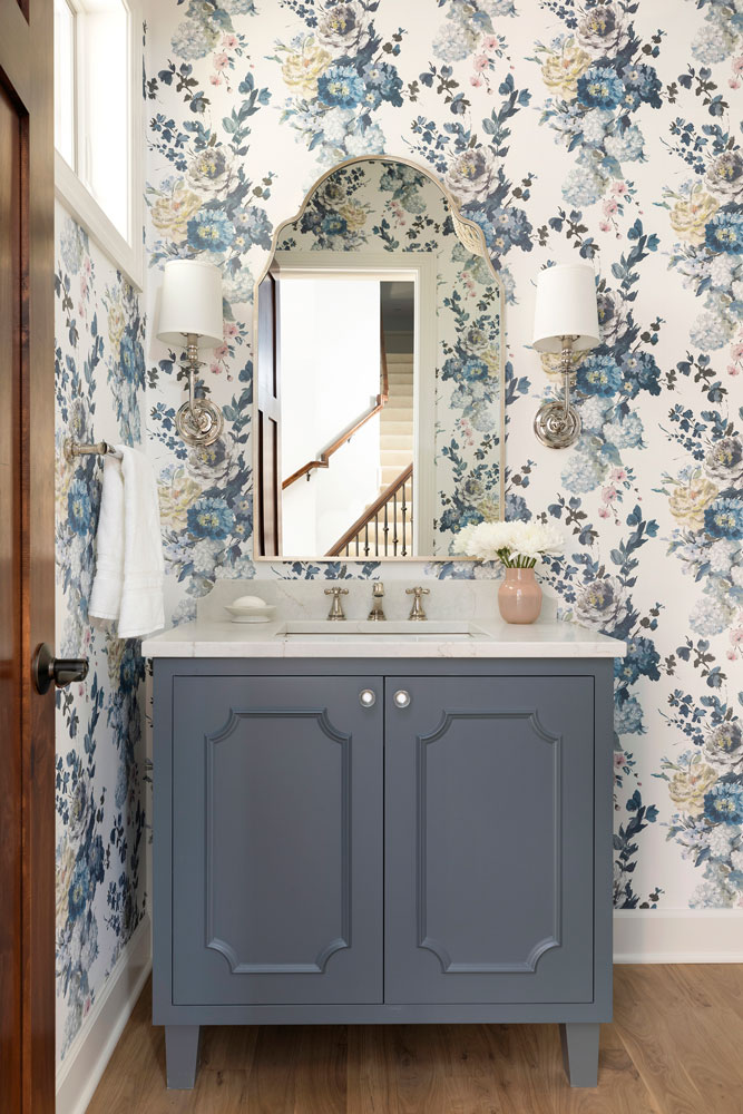
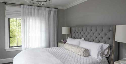
Subtle notes of blue and grey add contrast and elegance, seamlessly mixing warm and cool elements. The main flow wall color is Benjamin Moore Blue Veil adding the perfect dusty blue note. The mudroom features Sherwin Williams Knitting Needles, adding warmth while it disguises daily dirt and grime. And the powder room vanity is finished in Benjamin Moore Gray Shower, serving as a bold accent piece.
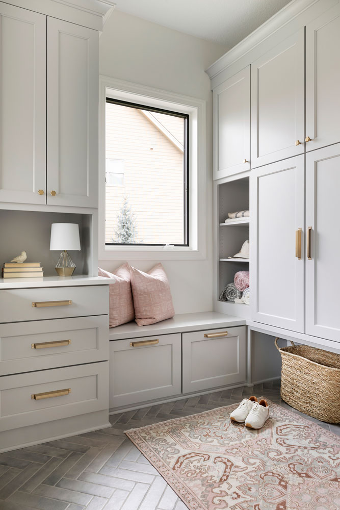
Love this home? View more photos of our Wayzata Kitchen Remodel here.
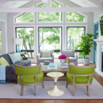
Going Bold
Greens can feel like a bold choice, but in a whole home palette, can accent a space and create overall cohesions. Subtle integration adds impact while keeping the overall aesthetic classic. This foyer, with its bold green mahogany chest, is an instant conversation starter. Equal parts elegant and timeless, the green is bold without being brash.
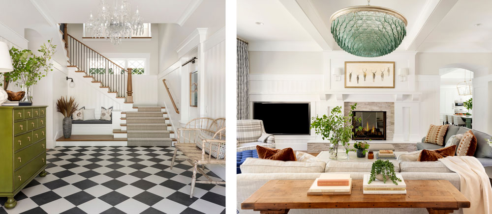
As you move to the living room, the green accents continue. A grand, (almost) 300 pound, green-glass chandelier graces the center of the room, serving as a spectacular focal point. Organic elements perfectly enhance bold, green tones.
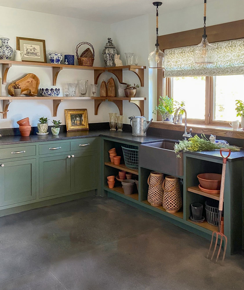
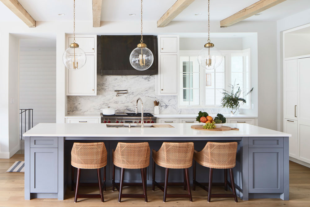
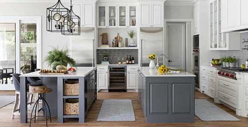
The kitchen island in Benjamin Moore Cambridge Green complements framed lake views and creates a soothing atmosphere within the hub of the home. And, a lower level garden room with Benjamin Moore Boreal Forest cabinetry functions for this client who loves to play in the dirt and create a mess.
This home feels thoughtful and calming with a main flow of Benjamin Moore Light Pewter and trim and molding in Benjamin Moore Oxford White.
Looking for more neutral and bold paint options? Check out our favorite paint colors here!
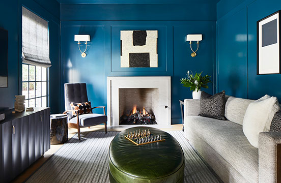
Shades of Blue All Over
We adore moody spaces and bold colors, but blending these dramatic spaces with a light, bright, and neutral whole home aesthetic can provide a challenge.
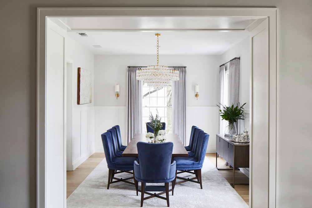
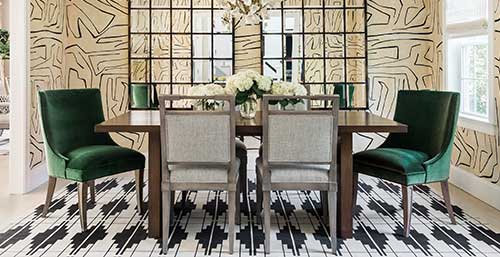
This home is simultaneously neutral with all the bold, blue-hued accents, and the kitchen demonstrates just that. White cabinetry and countertops with neutral walls provide a natural backdrop for a bluish-grey island in Benjamin Moore Rock Gray. From the kitchen to the dining room and throughout the main floor, the walls and trim feature Sherwin Williams Snowbound, a warm white. Jewel-toned blue velvet feels luxe against the neutral paint palette.
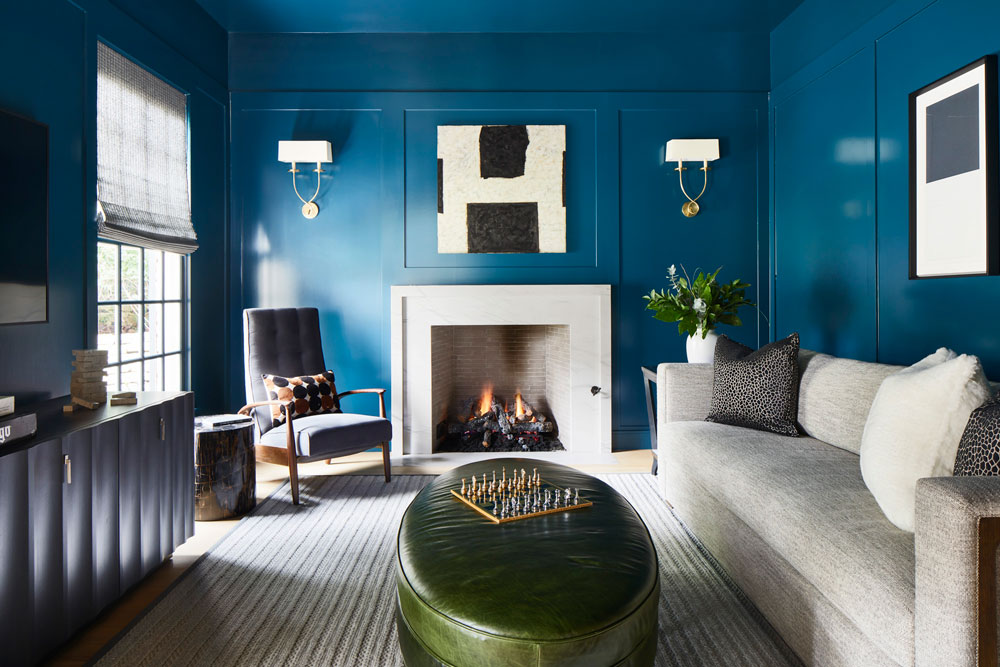
The den is truly a mood. Floor-to-ceiling wainscoting painted in Sherwin Williams Moscow Midnight is cozy, yet edgy. This space has attitude, while still feeling inviting. Neutral tones are integrated in the furnishings, adding texture and instant comfort.
Not diggin’ a bold blue? Why not try the Pantone Color of the Year 2022?! Check out more info here: Pantone.com
Paint is Personal
Paint is personal but it doesn’t have to be hard. When in doubt, find what inspires you and keep it simple. You can always add later. Consider the role daytime and nighttime lighting might play with a color choice and don’t be afraid to test some colors in your home. It’s best to start with your main flow color – and layer in bold accents, texture, and integrated color from there.
Happy Painting!
Related Posts
Our Studio & Our Story
Martha O’Hara Interiors is a full-service interior design firm that designs and furnishes homes from inspiration to flawless outcome…