Oh My Styled Life
O’Hara Interiors Paint Color Guide
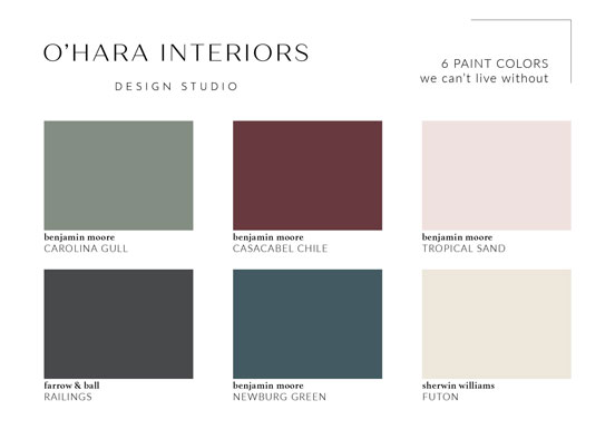
6 Shades We Can’t Live Without in 2024
Selecting the perfect paint color is an art, a decision that can make or break the ambiance of your home. The right hue can breathe life into a space, while the wrong one can leave it feeling dull and uninspired. If you’re interested in revitalizing a room this year, a fresh coat of paint is a simple way to achieve sensational results.
As you enter 2024, consider what kind of energy you want in your home. Do you want soothing warm tones or energizing brights to liven up your space? From tried-and-true greens and warmer whites to the new and exciting shades taking the design community by storm, our 2024 list of favorite paint colors caters to every mood and aesthetic, elevating your home to a new level of sophistication and elegance.
• Pastel Green • Sultry Red • Dusty Pink • Soft Black •
• Midnight Blue • Rich Neutral •
1. Moody Pastel Green
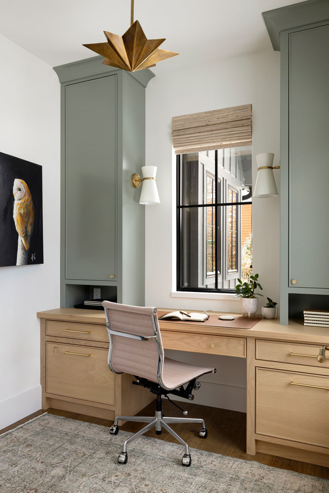
This light green color may be considered the new neutral because of its ability to integrate flawlessly with other hues. Our award-winning team often pairs this color with warm woods, pastels, or other neutral tones, making it an excellent base color for building your room’s palette. A light green evokes a subtle earthiness, making it a versatile option for both private and public spaces in the home.
Consider these other moody pastel green color options: Benjamin Moore Granada Villa, Sherwin Williams Underseas, and Farrow & Ball Castle Gray.
2. Sultry Red
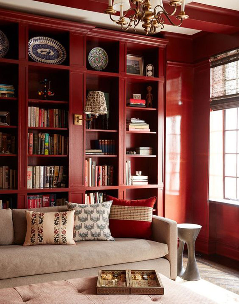
Sultry reds are taking the fashion world by storm, and the interior design community is embracing this color, too. Former Vogue editor and style icon Diana Vreeland famously adored a sultry red, even decorating an entire room of her Park Avenue apartment in the shade. Red is bold, conveying confidence and passion, so it’s important to carefully consider what shade best fits your vision for the room. A more muted red possesses the same alluring qualities as a cherry or blood-red hue but harnesses this empowering energy without overshadowing the other design elements or colors in your room.
We also adore these: Benjamin Moore Sweet Rosy Brown, Benjamin Moore Casacabel Chile, Sherwin Williams Reddened Earth
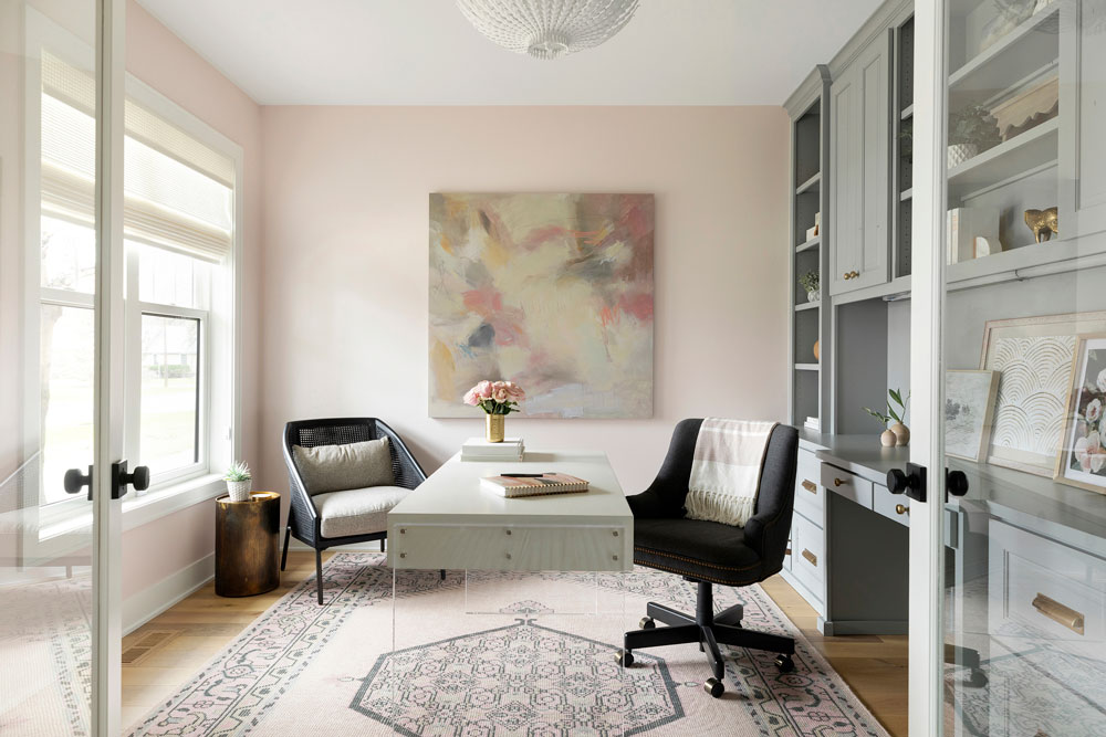
3. Dusty Pink
See the world through rose-colored glasses with a dusty pink. This hue invokes a soft and feminine elegance that is a dreamy departure from a traditional warm neutral. It pairs perfectly with both cool and warm tones, making it a versatile choice that fits well with rooms of varying functions. A soft pink is a lovely choice for a bedroom, powder room, or office, infusing a refreshing yet gentle energy into a space.
More dusty pink paint shades to consider: Farrow & Ball Pink Drab, Sherwin Williams Intimate White, and Sherwin Williams White Beet.
View more photos from our Interlachen Remodel, Minneapolis, MN HERE.
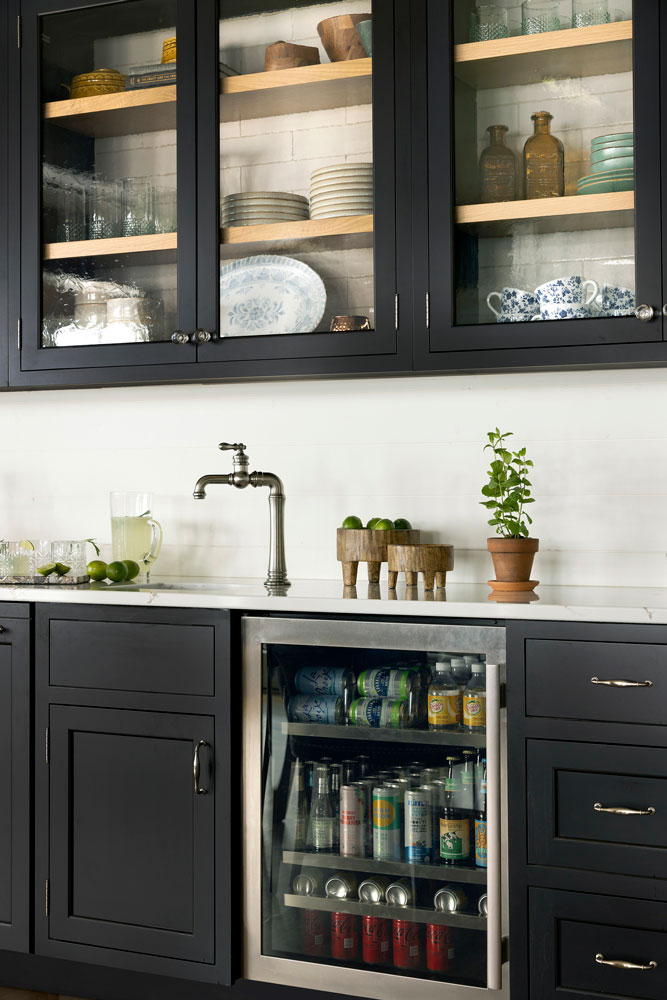
4. Soft Black
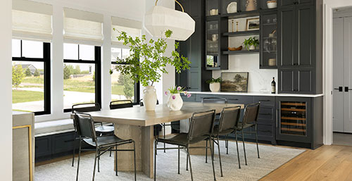
If you want a modern but not overly dramatic look, consider a soft black with warm undertones for cabinetry, accent furniture, or an accent wall. This departs from the ever-popular bright whites designers adore but achieves the same anchoring effect as a strong traditional neutral. Like white, black can also easily show smudges and dust; but don’t let this additional upkeep deter you. To best integrate this dark color with the rest of the room, select design features like glass, hardware finishes, and molding details that add dimension and balance out the intensity of black paint.
Check out these other soft black options: Benjamin Moore Wrought Iron, Benjamin Moore Abyss, and Farrow & Ball Railings
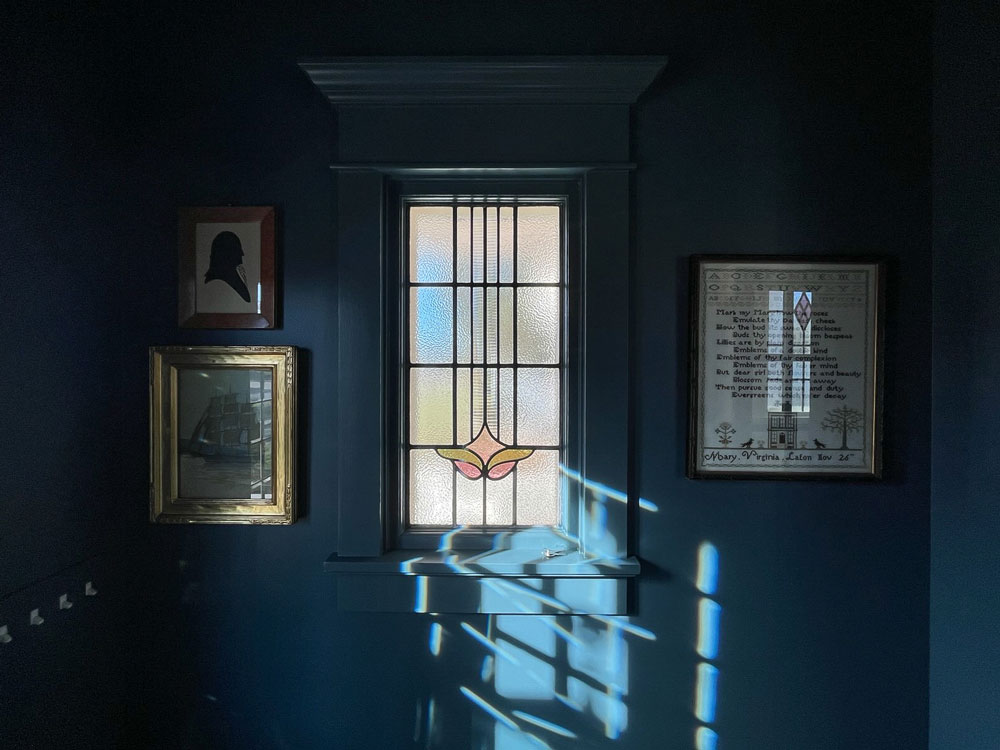
5. Midnight Blue
Midnight blue evokes starry nights and crashing ocean waves, invoking cool-toned dramatic flair that is striking and timeless. Blue is often associated with depth, sincerity, and wisdom, and our designers love to use this color in hospitality spaces, like an entry, family room, or guest bedroom. Experiment with sheen to achieve different results – high-gloss blues can up the drama, while a flat finish may feel more fitting for a casual space. This deep but not too dark blue makes it harder for the eye to define detail and creates a sense of expanse–perfect for a lengthening effect on walls or ceilings.
Newburg Green not quite the right shade for you? Consider these: Sherwin Williams Moscow Midnight, Benjamin Moore New Providence Navy, and Farrow & Ball Hopper Head
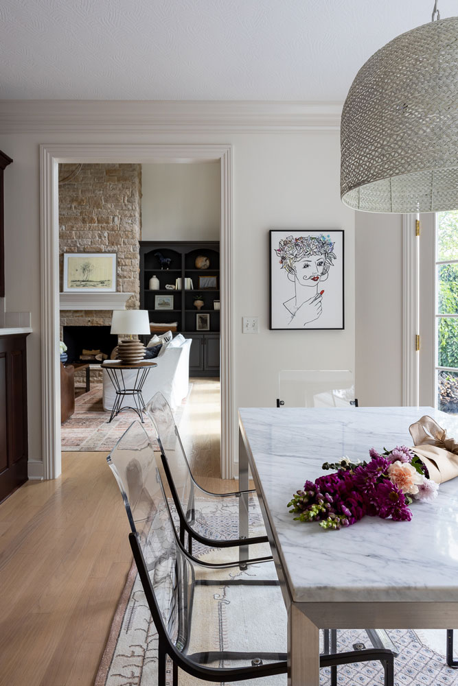
6. Rich Neutral
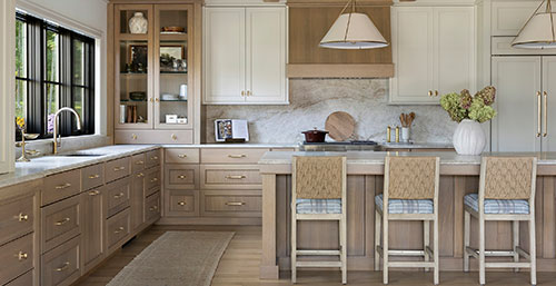
Neutrals never go out of style, but with so many options, it can be hard to select the perfect shade. We recommend considering an option that is rich and warm, acts as a lovely complementary color to many other hues, and makes your space feel welcoming and bright. This clean backdrop is a strong starting point for building out the rest of the room’s appearance because it works wonderfully with many styles of furnishings, artwork, or other design details.
Don’t be afraid to combine shades. As much as these are a clean canvas for furnishing a space, neutrals can also be viewed as color. Be attentive to undertones and realize how color comes into play, even amongst neutrals. For example, in the above photo, our designer used a darker cool beige trim and a lighter, cool beige on the walls for a cohesive look with subtle dimension.
More neutral paint colors we love: Benjamin Moore Alaskan Skies, Sherwin Williams Pacer White, and Farrow & Ball Blackened
Picture yourself surrounded by these alluring hues, basking in the warmth and luxurious finishes they exude. Our expertly chosen paint colors will inspire and delight, transforming your living spaces into a haven of beauty and comfort.
Written by Moni Briones


